Art Director / Designer / Illustrator
TAC-web-ipad-gif.gif

The Absolut Company

The Absolut Company got its start in 1979 when Absolut Vodka was launched on the U.S market with an iconic ad campaign - intimately connected to the world of art, design and fashion. 

To reflect their passion for innovation and progression through the decades, The Absolut Company was in need of a new visual identity. Embracing the creative diversity of the brand we created an identity based on a strict structural design system – intended to carry expressive and artistic content.

The core of the identity is a framework design that's used consistently in all layouts, both printed and digital. The framework can be filled with images, solid colors and text, for a diverse and dynamic expression.

The graphic toolbox is strict and functional, but is always applied with a creative approach. An evolving palette of bold colors distances the identity from traditional corporate communication. 

Created at Frankenstein Studio. 


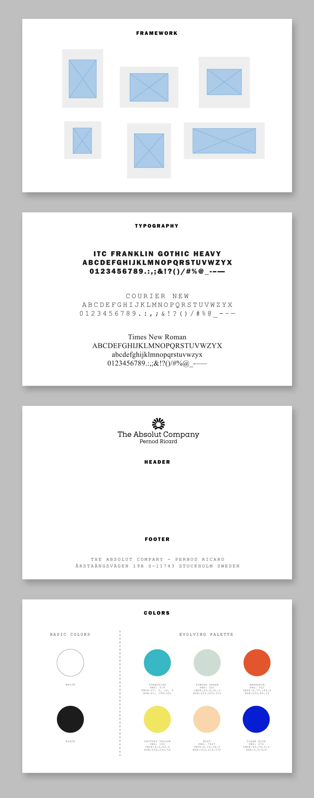
GRAFISK IDENTITET / DIGITAL DESIGN

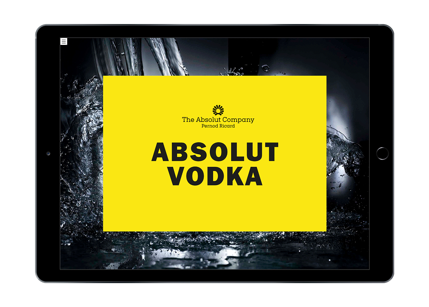
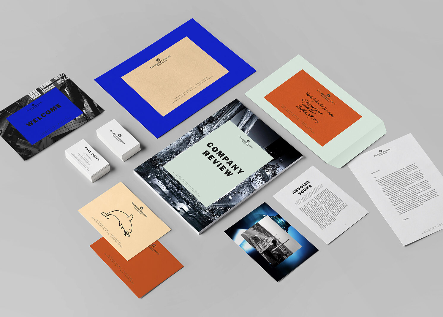
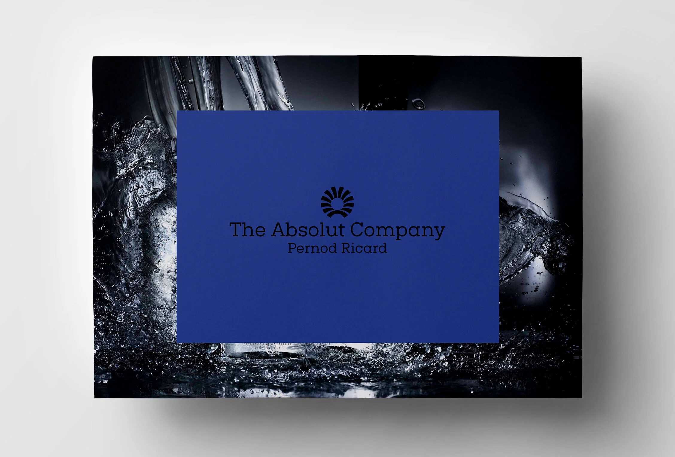
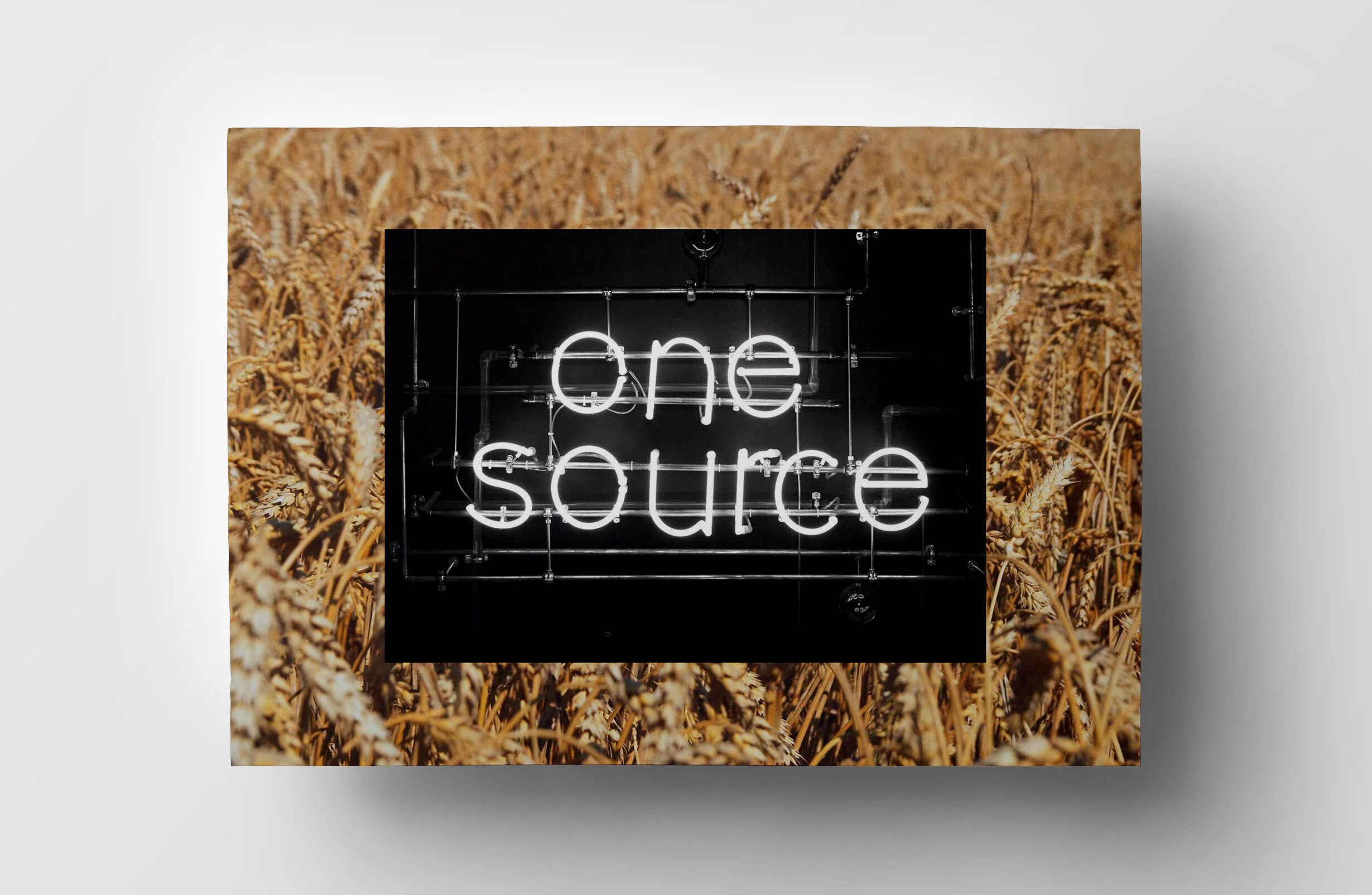
Ända sedan The Absolut Company lanserade Absolut Vodka med en ikonisk reklamkampanj 1979 har företaget varit känt för sin nära relation till konst-, design- och modevärlden. När The Absolut Company var i behov av en ny identitet tog vi fasta på den relationen och skapade ett strikt designsystem ämnat att fyllas med kreativt och konstnärligt innehåll i form av foton, färger och text.

De grafiska riktlinjerna för identiteten är enkla och kompromisslösa, men de resulterar i ett uttryck som är mycket dynamiskt och lekfullt. En färgpalett som ständigt utvecklas och förändras ger ytterligare en dimension av mångsidighet till identiteten.

 
TAC-web-ipad-gif.gif
TAC-overview.jpeg
TAC-profil.jpeg